css-样式与布局
css-样式与布局
1. 1px 问题
背景
- 其实就是在问, 如果要实现 0.5px 的方法, 主要问题是 在不同浏览器上, 小于 1px 的会默认为 1px
- css 1px 是逻辑像素, 而屏幕是逻辑像素, 设备像素比 dpr 不同, 逻辑像素最终转换为物理像素就不同
- 设备像素比 = 物理设备像素 / 逻辑像素
兼容性问题
chrome:把小于 0.5px 的当成0,大于等于 0.5px 的当作 1px
firefox:会把大于等于 0.55px 的当作 1px
safiri:把大于等于 0.75px 的当作 1px 进一步在手机上观察 iOS 的 Chrome 会画出 0.5px的边,而安卓(5.0)原生浏览器是不行的。所以直接设置 0.5px 不同浏览器的差异比较大
实现方式
box-shadow 模拟边框
.div {
  box-shadow: inset 0px -1px 1px -1px #c8c7cc;
}
伪元素 + transform
.scale-1px {
  position: relative;
  border:none;
}

.scale-1px:after {
  content: '';
  position: absolute;
  bottom: 0;
  background: #000;
  width: 100%;
  height: 1px;
  /*核心是利用transform缩放边框*/
  -webkit-transform: scaleY(0.5);
  transform: scaleY(0.5);
  -webkit-transform-origin: 0 0;
  transform-origin: 0 0;
}
这个实现方式, 可以通过 js 获取设备像素比, 来判断要用什么缩放比例
if (window.devicePixelRatio && devicePixelRatio >= 2) {
   document.querySelector('ul').className = 'scale-1px'
}
2. CSS 操作题 总结
操作题主要包括: 选择器优先级、定位 (布局)、盒子模型
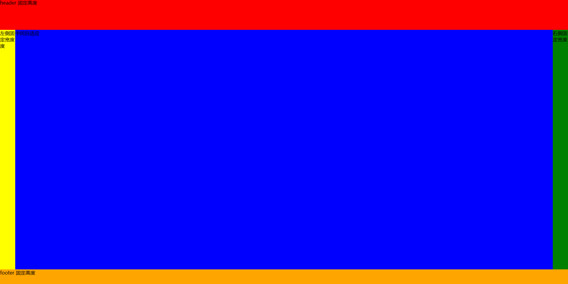
布局问题 (实现下面图片的样式)
<!DOCTYPE html>
<html lang="en">
<head>
  <meta charset="UTF-8">
  <meta http-equiv="X-UA-Compatible" content="IE=edge">
  <meta name="viewport" content="width=device-width, initial-scale=1.0">
  <title>Document</title>
</head>
<style>
  * {
    padding: 0;
    margin: 0;
  }
  body {
    display: flex;
    flex-direction: column;
    height: 100vh;
  }
  .header {
    width: 100%;
    height: 100px;
    background: red;
  }
  .middle-box {
    flex: 1;
    display: flex;
  }
  .box-left {
    width: 50px;
    background: yellow;
  }
  .box-middle {
    flex: 1;
    background: blue;
  }
  .box-right {
    width: 50px;
    background: green;
  }
  .footer {
    width: 100%;
    height: 50px;
    background: orange;
  }
</style>
<body>
  <header class="header">header 固定高度</header>
  <section class="middle-box">
    <aside class="box-left">左侧固定宽度度</aside>
    <section class="box-middle">中间自适应</section>
    <aside class="box-right">右侧固定宽度</aside>
  </section>
  <footer class="footer">footer 固定高度</footer>
</body>
</html>
要点
- CSS flex 布局要熟练
- 标签语义化, 但是面试可以这样写, 工作中大多没必要, div + css 即可, 需要 SEO 再用语义化标签
3. CSS 高级语法的应用
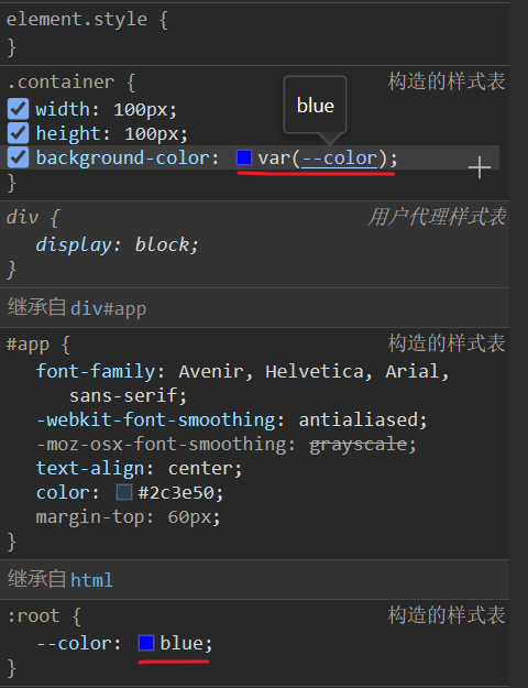
主题切换
- 使用 css 变量
/* 习惯性写法 写在根元素上,等同于写 html 上,因为 :root 就是 html文档的另一种写法罢了 */
:root {
    --color: #333;
}

html {
   --color: #333;
}

/* 也可以写在 body 上,也能生效,但是权重没 html、:root 高 */
body {
   --color: #333;
}

/* 使用 var 应用 css 变量 */
p {
    color: var(--color);
}
- 使用 sass 变量
/* 普通定义 */
$sysColor: red;

p {
  color: $sysColor;
}

/* 全局定义,使用关键字 !global */
/* 在任意位置定义全局变量,任何地方都调用 */
/* 如果和普通变量重名,会覆盖普通变量 */
.contetnt {
  $sysColor: grenn !global;
}

.container {
  color: $sysColor; // green
}
- 使用 less 变量
/* 变量定义 */
@sys-color: red;

p {
  color: @sys-color;
}
每一种变量在实际开发中的运用
动态改变背景颜色与字体颜色,在 vue、react 中的运用
vue 中的使用
创建项目
npm init vite-app vue-css
cd vue-css
npm install
npm run dev
- css 变量
<!-- App.vue -->
<template>
<div ref="root" class="container" @click="changeColor"></div>
</template>
<script setup lang="ts">
import { ref } from 'vue'
const root = ref<any>(null)
/* 改变颜色 */
const changeColor = () => {
root.value.style.setProperty('--color', 'green')
}
</script>
<style>
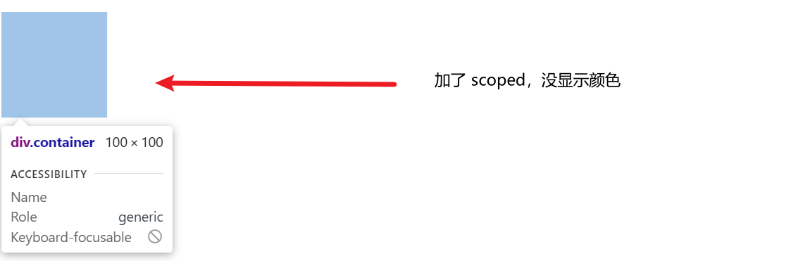
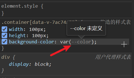
/* 注意不要加 scoped,不然会导致 :root 中定义 css 属性将会失效 */
:root {
--color: blue;
}
.container {
width: 100px;
height: 100px;
background-color: var(--color);
}
</style>
注意不要加 scoped,不然会导致 :root 中定义 css 属性将会失效
加了 scoped
没加 scoped
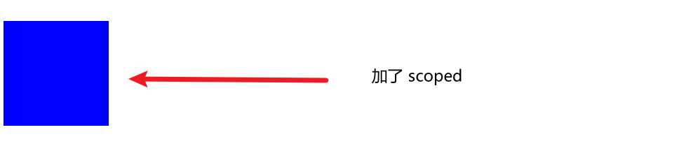
scoped 的作用是实现组件私有化,当前模块样式不对全局样式进行污染,表示当前 style 属性只属于当前模块
而 :root 是直接修改 根元素属性,也就无法生效了
- sass 变量
修改样式的原理还是使用 setProperty 修改 css 变量来间接修改 sass变量
<template>
  <div ref="root" class="container" @click="changeColor"></div>
</template>

<script setup lang="ts">
import { ref } from 'vue'
const root = ref<any>(null)

/* 改变颜色 */
const changeColor = () => {
  root.value.style.setProperty('--color', 'green')
}

</script>


<style scoped lang="scss">

/* var(设置值,默认值),没有设置值就使用默认值 */
$sysColor: var(--color, red);

.container {
  width: 100px;
  height: 100px;
  background-color: $sysColor;
}

</style>
- less 变量
<template>
  <div ref="root" class="container" @click="changeColor"></div>
</template>

<script setup lang="ts">
import { ref } from 'vue'
const root = ref<any>(null)

/* 改变颜色 */
const changeColor = () => {
  root.value.style.setProperty('--color', 'green')
}

</script>


<style scoped lang="less">

/* var(设置值,默认值),没有设置值就使用默认值 */
@sysColor: var(--color, red);

.container {
  width: 100px;
  height: 100px;
  background-color: @sysColor;
}

</style>
小结
定义变量区别
/* css */
:root {
  --color: blue;
}

.container {
  width: 100px;
  height: 100px;
  background-color: var(--color);
}
/* sass */
$sysColor: var(--color, red);

.container {
  width: 100px;
  height: 100px;
  background-color: $sysColor;
}
/* less */
@sysColor: var(--color, red);

.container {
  width: 100px;
  height: 100px;
  background-color: @sysColor;
}
改变样式的核心,修改 css 变量
/* 改变颜色 */
const changeColor = () => {
  root.value.style.setProperty('--color', 'green')
}
react 中使用
总结(表格)
计算属性
- calc
.main {
    min-height: clac(100vh - 80px)
}
4. CSS 常见的选择器
选择器 (11种)
- 通配符选择器 (
* {...}) - 标签选择器 (
p {...}) - 类选择器 (
.class {...}) - id 选择器 (
#id {...}) - 属性选择器 (
[title=“Lin”] {...}),title=“Lin”的所有元素设置样式 - 并集选择器 (
span, div, .content {...}) - 后代选择器 (
div p {...}) - 子代选择器 (
div>p {...}) - 兄弟选择器 (
h1 + p {...}) - 伪类选择器 (
:hover {...}) - 伪对象选择器 (
:before {...})
css 优先规则
!import > 内联样式 > ID 选择器 > 类选择器 = 属性选择器 = 伪类选择器 > 标签选择器 = 伪元素选择器
CSS样式的优先级应该分成五大类
- 第一类
!important,无论引入方式是什么,选择器是什么,它的优先级都是最高的。 - 第二类引入方式,行内样式的优先级要高于嵌入和外链,嵌入和外链如果使用的选择器相同就看他们在页面中插入的顺序,在后面插入的会覆盖前面的
- 第三类选择器,选择器优先级:id选择器>(类选择器 | 伪类选择器 | 属性选择器 )> (后代选择器 | 伪元素选择器 )> (子选择器 | 相邻选择器) > 通配符选择器
- 第四类继承样式,是所有样式中优先级比较低的
- 第五类浏览器默认样式优先级最低
加分回答 使用 !important 要谨慎
- 一定要优先考虑使用样式规则的优先级来解决问题而不是
!important - 只有在需要覆盖全站或外部 CSS 的特定页面中使用
!important - 永远不要在你的插件中使用
!important - 永远不要在全站范围的 CSS 代码中使用
!important优先级的比较指的是相同的样式属性,不同样式属性优先级比较失效 - 比如:在设置
max-width时注意,已经给元素的max-width设置了!important但是还不生效,很有可能就是被 width 覆盖了 - 举例:
div最终的宽度还是200pxdiv { max-width: 400px !important; height: 200px;background-color: tomato; width: 200px; }
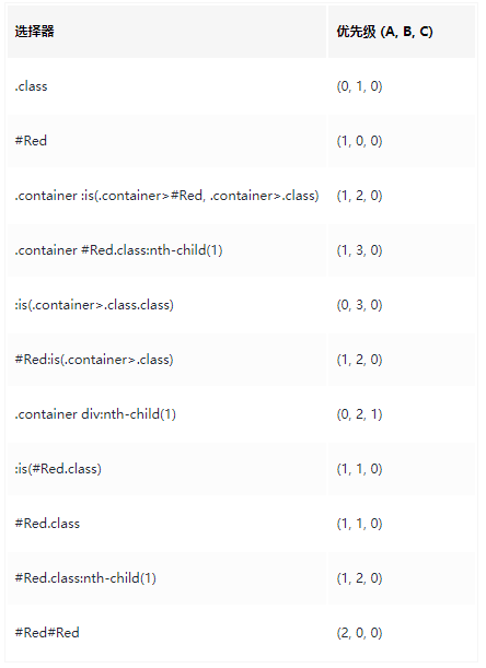
css选择器优先级计算方法
查看每个级别优先级的数量,就能判断优先级高低
子代 和 后代的区别
- 子代选择器只选中
父级元素的亲一代,父子级之间用大于号>连接 - 后代选择器选中的是指定元素的
所有后代,父子级之间用空格连接
伪选择器
- 伪类选择器
- 伪对象选择器
5. CSS 优化、提高性能的方法有哪些?
将样式尽量写在单独的一个 css 文件中,然后在 head 元素中引用
好处:
内容和样式分离,易于管理和维护
减少页面体积
css 文件可以被缓存、重用,维护成本降低
少使用 @import, @import 影响 css 文件的加载速度
避免使用复杂的选择器,层级越少越好,建议选择器的嵌套最好不要超过三层简洁的选择器不仅可以减少 css 文件大小
提高页面的加载性能,浏览器解析时也会更加高效,也会提高开发人员的开发效率,降低了维护成本
精简页面的样式文件,去掉不用的样式
6. 响应式布局实现方式有哪些?
实现方式
- 媒体查询
- 百分比
- vw / vh
- rem
- flex
- UI 库
7. 清除浮动的方法有哪些?
- 给父元素也添加 float
- 给父元素一个固定高度
- 给父元素的伪类设置
content:" ";
clear:both;/*清除浮动*/
display:block;/*确保该元素是一个块级元素*/
- 给父元素添加 overflow:hidden
8. float 高度塌陷?
现象: 父元素为0, 子元素无法撑开父元素
原因: 当元素设置浮动后,会自动脱离文档流
解决: 清除浮动
9. display:inline-block 有缝隙?
原因: 两个内联元素之间有一定的空隙,如 换行符、制表符(tab)、空格等字符引起的
解决办法
- 不换行
- 设置其父容器的
font-size为 0,再设置内联元素的字体大小 - 添加注释
- 设置
float:left,但是要清除浮动
10. 多行文本垂直居中
方法一: 父元素使用 display:table 和子元素使用 display:table-cell 属性来模拟表格
子元素设置 vertical-align:middle 即可垂直居中

<div class="span_box bg_box">
    <span class="words_span">
        方法一:父元素使用display:table和子元素使用display:table-cell
        属性来模拟表格,子元素设置vertical-align:middle即可垂直居中
    </span>
</div>
<style>
	.bg_box {
        width: 300px;
        height: 300px;
        margin-top: 20px;
        background-color: #BBBBBB;
    }
    /*方法一*/
    .span_box {
        display: table;
    }
    .words_span {
        display: table-cell;
        vertical-align: middle;
    }
</style>
方法二:对子元素设置 display:inline-block 属性,使其转化成行内块元素,模拟成单行文本。父元素设置对应的height 和 line-height。对子元素设置 vertical-align:middle 属性,使其基线对齐。添加 line-height 属性,覆盖继承自父元素的行高。缺点:文本的高度不能超过外部盒子的高度。

<div class="p_box bg_box">
    <p class="words_p">
        方法二:对子元素设置display:inline-block属性,使其转化成行内块元素,模拟成单行文本。父元素设置
    </p>
</div>
<style>
.bg_box {
    width: 300px;
    height: 300px;
    margin-top: 20px;
    background-color: #BBBBBB;
}
/*方法二*/
.p_box {
    line-height: 300px;
}
.words_p {
    display: inline-block;
    line-height: 20px;  /*单独给子元素设置行高,覆盖父级元素的行高*/
    vertical-align: middle;  /*基线居中对齐*/
}
</style>
方法三:脱离文档流的居中方式,把内部div设置宽高之后,再设置top为50%,使用负边距调整,将margin-top设置为负的高度的一半就可以垂直居中了。缺点:需要计算出多行文字固定的高度。高度一旦改变,负边距也要调整。
<div class="wrapper bg_box">
    <div class="content_box">
        方法三:脱离文档流的居中方式,把内部div设置宽高之后,再设置top为50%,使用
    </div>
</div>
<style>
.bg_box {
    width: 300px;
    height: 300px;
    margin-top: 20px;
    background-color: #BBBBBB;
}
/*方法三*/
.wrapper {
    position: relative;
    overflow: hidden;
}
.content_box {
    position: absolute;
    top: 50%;
    width: 300px;
    height: 127px; /*本页面中这么多文字的高度,文本篇幅改变,高度也会变*/
    margin-top: -63.5px;  /*height的一半*/
}
</style>
11. div 居中的方法有哪些?
1. flex 布局实现 (元素已知宽度)
<div class="box">
    <div class="a"></div>
</div>
<style>
    .box{
        width: 300px;
        height: 300px;
        background-color: #ccc;
        display: flex;
        display: -webkit-flex;
        justify-content: center;
        align-items: center;
    }
    .box .a{
        width: 100px;
        height: 100px;
        background-color: blue;
    }
</style>
2. position (元素已知宽度)
父元素设置为:position: relative;
子元素设置为:position: absolute;
距上50%,据左50%,然后减去元素自身宽度的一半距离就可以实现
<div class="box">
    <div class="a">love</div>
</div>
<style>
    .box{
        width: 300px;
        height: 300px;
        background-color: red;
        position: relative;
    }
    .box .a{
        width: 100px;
        height: 100px;
        background-color: blue;
        position: absolute;
        left: 50%;
        top: 50%;
        margin: -50px 0 0 -50px;
    }
</style>
3. position transform (元素未知宽度)
如果元素未知宽度,只需将上面例子中的
margin: -50px 0 0 -50px替换为:transform: translate(-50%,-50%)
<style>
    .box{
        width: 300px;
        height: 300px;
        background-color: red;
        position: relative;
    }
    .box .a{
        background-color: blue;
        position: absolute;
        top: 50%;
        left: 50%;
        transform: translate(-50%, -50%);
    }
</style>
4. position (元素已知宽度)
left,right,top,bottom为0,maigin:auto
<div class="box">
    <div class="a">love</div>
</div>
<style>
    .box{
        width: 300px;
        height: 300px;
        background-color: red;
        position: relative;
    }
    .box .a{
        width: 100px;
        height: 100px;
        background-color: blue;
        position: absolute;
        top: 0;
        bottom: 0;
        left: 0;
        right: 0;
        margin: auto;
    }
</style>
12. 如何画 0.5px 的线?
法一
1px的线通过 meta viewport 中, scale 的设置,可以缩放变成 0.5 倍, 则得到 0.5px 的线
<meta name="viewport"
      content="width=device-width,
               initial-scale=0.5,
               minimum-scale=0.5,
               maximum-scale=0.5"/>
法二
为 1px 的线添加上CSS样式, transform:scaleY(0.5)
#line {
	border-bottom:1px solid black;
	transform:scaleY(0.5);
}
13. flex 布局怎么把元素搞到右下角?
<!DOCTYPE html>
<html lang="en">
<head>
    <meta charset="UTF-8">
    <meta http-equiv="X-UA-Compatible" content="IE=edge">
    <meta name="viewport" content="width=device-width, initial-scale=1.0">
    <title>Document</title>
    <style>
        * {
            padding: 0;
            margin: 0;
        }
        body {
            height: 100vh;
            display: flex;
            justify-content: flex-end;
            align-items: flex-end;
        }
        .box {
            width: 100px;
            height: 100px;
            background: orange;
        }
    </style>
</head>
<body>
    <div class="box"></div>
</body>
</html>
14. flex 高度继承
父元素为 flex 布局时, 没有设置高度的子元素与父元素高度一致
如果父元素设置固定高度,则子元素中没有设置高度的元素将继承父元素的高度;但是如果父元素的 align-items 设置以后那么子元素的高度则会有自身内容决定
如果父元素没有设置高度,其高度由最高的子元素决定
15. 子元素在什么情况不会撑起父元素的高度
一般父级是不设置高度的,他里面的子级内容就会随子级内容高度的增加而自动增高,这样做的好处是样式很灵活,修改子级内容的时候没必要再修改父级的高度。
另外如果父级没设置高度,内部有子级浮动的时候,会使子级页面超出父级, 这种情况也叫 ”高度塌陷“
16. 如何让文字过长, 显示省略号
.ellipse {
    text-overflow: ellipsis;
    white-space: nowrap;
    overflow: hidden;
}

/* 当行省略 */
.singe-line {
    text-overflow: ellipsis;
    overflow: hidden;
    word-break: break-all;
    white-space: nowrap;
}
17. 上下边距重叠
边距重叠, 只有上下边距才会, 左右不会
场景: 上下两个 div, 中间没有其他元素, 他们外边距会发生重叠, 上下边距重叠, 会取较大的 margin
18. BFC (块级格式上下文)
BFC 的作用: 内部元素 不影响 外部元素
position: absolute或fixeddisplay: inline-block、table、flexfloat:不为none
19. CSS 性能优化
20. 伪元素、伪类选择器
伪元素
- :active 匹配被点击的链接
- :checked 匹配处于选中状态的
<input>元素 - :disabled 匹配每个被禁用的
<input>元素 - :focus 匹配获得焦点的
<input>元素 - :hover 匹配鼠标悬停其上的元素
伪类选择器
- ::after 在元素之后插入内容
- ::before 在元素之前插入内容
- ::first-line 匹配元素中内容的首行
- ::first-letter 匹配元素中内容的首字母
21. 画 三角形
<!DOCTYPE html>
<html lang="en">
<head>
    <title>如何实现一个扇形</title>
    <style>
        #triangle{
            width: 0;
            border-top: 100px solid red;
            border-bottom: 100px solid yellow;
            border-left: 100px solid green;
            border-right: 100px solid blue;
        }
    </style>
</head>
<body>
    <div id="triangle"></div>
</body>
</html>
补充知识点 画六边形
两个反方向且底边同样大小的梯形,叠加在一起,是不是就能得到一个六边形
.pentagon {
    position: relative;
    width: 60px;
    border-bottom: 60px solid yellowgreen;
    border-left: 40px solid transparent;
    border-right: 40px solid transparent;
}
.pentagon::before {
    content: "";
    position: absolute;
    width: 60px;
    height: 0px;
    top: 60px;
    left: -40px;
    border-top: 60px solid yellowgreen;
    border-left: 40px solid transparent;
    border-right: 40px solid transparent;
}
22. CSS 尺寸单位有哪些?
- px: 绝对像素
- rem: 相对于根元素像素
- em: 相对于父元素像素
- vw、vh: 视图宽高
- %: 根据父元素的宽高的百分比
23. 说一说 BFC
什么是 BFC
块级格式化上下文、独立的渲染区域、不会影响边界以外的元素
如何形成 BFC
- float 不为 none
- postion 为 absolute、fixed
- display 为 flex、inline-flex
- overflow 为 visible
BFC 解决了什么问题 (或者说应用场景)
- 清除浮动, 解决高度塌陷问题(父元素没设置高度,子元素设置浮动,导致父元素高度为 0)
- 解决 上下 margin 合并问题
- 元素被浮动元素覆盖的问题
[详细文章]
24. flex 布局
均匀布局
flex-grow: 1 实现均匀布局原理
将子元素剩余宽度,按比例进行分配,三个子元素flex-grow 都为 1,就是每个子元素都占 1/3
基本情况
<template>
  <div class="flex" style="width: 600px; height: 200px">
  	<div class="flex1" style="background-color: red"></div>
    <div class="flex1" style="background-color: blue"></div>
    <div class="flex1" style="background-color: yellow"></div>
  </div>
</template>

<style scoped lang="scss">
    .flex {
        display: flex;
    }
    .flex1 {
        flex-grow: 1;
    }
</style>
三个子 div 没有设计宽度的情况的下,设置flex-grow: 1 ,那么都是三个都会均分剩余宽度,那个结果就是三个均分父元素宽度
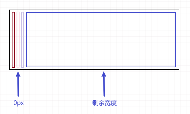

其中某元素有宽度
<template>
  <div class="flex" style="width: 600px; height: 200px">
  	<div class="flex1" style="width: 300px; background-color: red;"></div>
    <div class="flex1" style="background-color: blue;"></div>
    <div class="flex1" style="background-color: yellow;"></div>
  </div>
</template>

<style scoped lang="scss">
    .flex {
        display: flex;
    }
    .flex1 {
        flex-grow: 1;
    }
</style>
其中一个元素有宽度 300px,那么 flex-grow: 1 就会将剩余的 300px,均分给三个子元素,也就是 400px 100px 100px
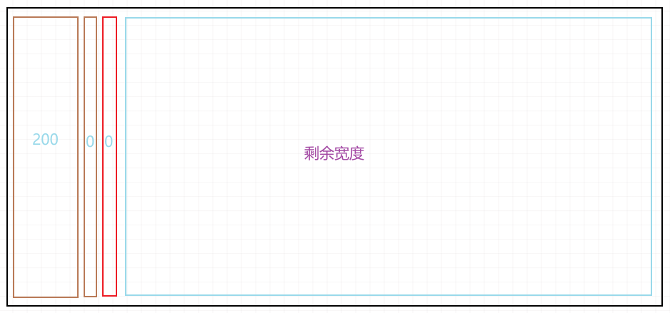

解决办法
为了解决这个问题,加入属性 flex-basis: 0
flex-basis 指定了 flex 元素在主轴方向上的初始大小
<template>
  <div class="flex" style="width: 600px; height: 200px">
  	<div class="flex1 flex-basis-0px" style="width: 300px; background-color: red;"></div>
    <div class="flex1 flex-basis-0px" style="background-color: blue;"></div>
    <div class="flex1 flex-basis-0px" style="background-color: yellow;"></div>
  </div>
</template>

<style scoped lang="scss">
    .flex {
        display: flex;
    }
    .flex1 {
        flex-grow: 1;
    }
    .flex-basis-0px {
        flex-basis: 0
    }
</style>
那么这样设置后,每个子元素主轴方向上的初始大小都是 0,不会收 width 已经子元素内容,影响整体布局
25. 图片固定宽高比
只设置宽度,不设置高度的情况,如何让图片固定宽高比
{
    width: 100px;
    aspect-ratio: 4/3;
}

/* 浏览器解析结果 */
{
    width: 100px;
    height; 75px;
}